

© Creative Gateway 2002 - 2018 All Rights Reserved
Book design and typography
FAQs
Cover Book File
Q: What format should I supply my images in? A: JPEG or PNG is fine, we will transform them into appropriate resolutions and other formats where necessary. Q: I’m not sure who owns the copyright of my images? A: If you have taken them yourself then you own the copyright but we will advise if there is doubt, and independently check if possible. Images plucked randomly from the web which could breach copyright and trigger legal proceedings should be avoided. Royalty free stock photo images and illustrations are acceptable. Q: What are stock photo images and will they cost? A: We have access to a number of sites which provide downloadable royalty free images usable for book covers. Some are free but most incur a small change. We will send you a choice of watermarked images to choose from and then purchase the ones you like. Charges can be found in pricing. Q: Will I be able to comment on cover designs in progress? A: Yes. We will share a number of suitable draft covers for you to peruse as JPEG images. Only when you’re happy with the design, typography, colours and content do you sign it off for use. Q: Do you create an eBook cover separately? A: Not usually. For consistency of appearance, on say Amazon, we use the front of the full print cover where possible. Q: Regarding colour schemes, I have heard of the RGB and CMYK variants, what are they and what do you use? A: Put simply, RGB images are utilised by computer, tablet and phone screens and can have a huge variety of hues and tints whereas printers use the more restricted CMYK colour ranges. Your final file has to be fixed as a PdF file in CMYK but we can initially work in either although sometimes a little compromise in final colour may have to be accepted on conversion
Understanding a book print cover
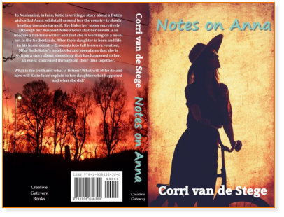
Using Notes on Anna once more as an example, we will explain the different features of how this cover was constructed. A cover is typically sectioned into three parts for card printing, the rear, spine and front areas and then folded and glued onto the book carcass. The complete cover is accurately sized digitally to the dimensions required, in this case, for a 5” X 8” paperback and the width of the spine is determined by the number of pages and thickness of printed paper to be used. The image of the girl on the bicycle looking to the future, matching the story, was found on a stock photo website. The rear cover was the author’s own image. Note how this was stretched to cover the spine too, then using digital colouring and effects, the two images were combined into a vibrant and complimentary whole colour scheme and design. The title and name fonts were chosen and sized to look well and legible on the cover without being overbearing. White is often used on covers as it contrasts well with darker backgrounds to make the book easy to discern on a shelf. Two or three fonts are normally sufficient for a cover or it becomes too busy. Chosen fonts can look good if one is a serif book font and one a complimentary sans serif font, for example Minion Pro for a name sat alongside Myriad Pro for a title. We have access to a huge variety of fonts for style and match. The descriptive summary content on the rear cover was provided by the author and set up in a font and size to be readable and succinct whilst still allowing the dramatic sunset burning effect to come through. Often, the cover content is centre justified to sit nicely on the overall page. An important and mandatory area is the ISBN block in white on the rear cover. This has to be pre-configured with a scannable ISBN book classification number and optional price code. As outlined in the Inner Book File FAQs, we will advise clearly on how to get an ISBN number for your book. In this case, also added are the names of the publisher, typically on the spine and back cover but depending on who is publishing your book, that is up to you. Click on Services, Prices or Contact on the menu bar


Made with Xara
Book design and
typography
FAQs
Cover Book File
Q: What format should I supply my images in? A: JPEG or PNG is fine, we will transform them into appropriate resolutions and other formats where necessary. Q: I’m not sure who owns the copyright of my images? A: If you have taken them yourself then you own the copyright but we will advise if there is doubt, and independently check if possible. Images plucked randomly from the web which could breach copyright and trigger legal proceedings should be avoided. Royalty free stock photo images and illustrations are acceptable. Q: What are stock photo images and will they cost? A: We have access to a number of sites which provide downloadable royalty free images usable for book covers. Some are free but most incur a small change. We will send you a choice of watermarked images to choose from and then purchase the ones you like. Charges can be found in pricing. Q: Will I be able to comment on cover designs in progress? A: Yes. We will share a number of suitable draft covers for you to peruse as JPEG images. Only when you’re happy with the design, typography, colours and content do you sign it off for use. Q: Do you create an eBook cover separately? A: Not usually. For consistency of appearance, on say Amazon, we use the front of the full print cover where possible. Q: Regarding colour schemes, I have heard of the RGB and CMYK variants, what are they and what do you use? A: Put simply, RGB images are utilised by computer, tablet and phone screens and can have a huge variety of hues and tints whereas printers use the more restricted CMYK colour ranges. Your final file has to be fixed as a PdF file in CMYK but we can initially work in either although sometimes a little compromise in final colour may have to be accepted on conversion
Understanding a book print cover
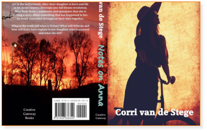
Using Notes on Anna once more as an example, we will explain the different features of how this cover was constructed. A cover is typically sectioned into three parts for card printing, the rear, spine and front areas and then folded and glued onto the book carcass. The complete cover is accurately sized digitally to the dimensions required, in this case, for a 5” X 8” paperback and the width of the spine is determined by the number of pages and thickness of printed paper to be used. The image of the girl on the bicycle looking to the future, matching the story, was found on a stock photo website. The rear cover was the author’s own image. Note how this was stretched to cover the spine too, then using digital colouring and effects, the two images were combined into a vibrant and complimentary whole colour scheme and design. The title and name fonts were chosen and sized to look well and legible on the cover without being overbearing. White is often used on covers as it contrasts well with darker backgrounds to make the book easy to discern on a shelf. Two or three fonts are normally sufficient for a cover or it becomes too busy. Chosen fonts can look good if one is a serif book font and one a complimentary sans serif font, for example Minion Pro for a name sat alongside Myriad Pro for a title. We have access to a huge variety of fonts for style and match. The descriptive summary content on the rear cover was provided by the author and set up in a font and size to be readable and succinct whilst still allowing the dramatic sunset burning effect to come through. Often, the cover content is centre justified to sit nicely on the overall page. An important and mandatory area is the ISBN block in white on the rear cover. This has to be pre-configured with a scannable ISBN book classification number and optional price code. As outlined in the Inner Book File FAQs, we will advise clearly on how to get an ISBN number for your book. In this case, also added are the names of the publisher, typically on the spine and back cover but depending on who is publishing your book, that is up to you. Click on Services, Prices or Contact on the menu bar

© Creative Gateway 2002 - 2018 All Rights Reserved