

© Creative Gateway 2002 - 2018 All Rights Reserved
Book design and typography
GALLERY
A few of our favourite covers
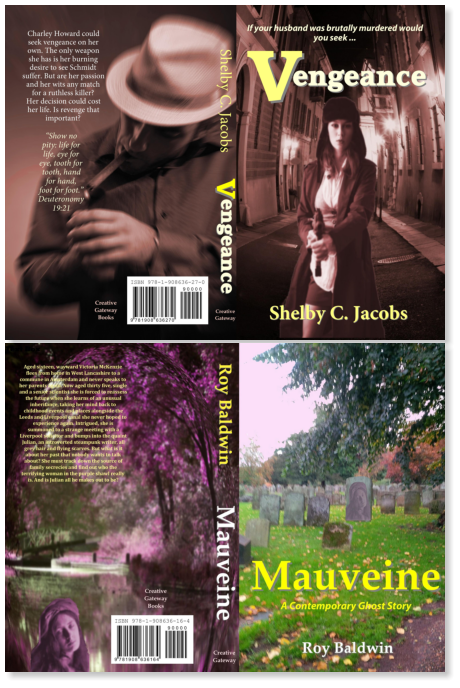
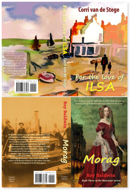
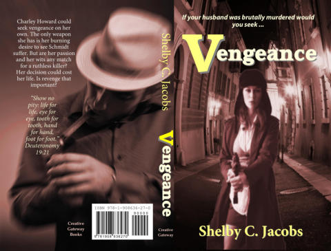
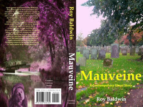
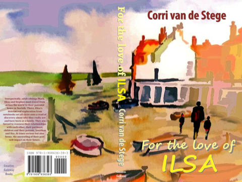
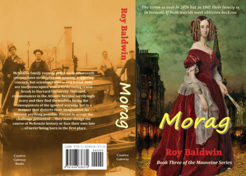
One reason why we recommend designing the inner book file and the cover together, particularly with fiction, is the joint process creates an interconnecting environment where the cover can be created to reflect important aspects of the story that you, the writer, would like shown, as well as incorporating a compelling and attractive design. We invite you to peruse these print covers, and enjoy identifying those author selected aspects in the book which you think the cover tells you about the story.An example of an interior page
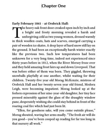
Above is a typeset black and white 5” X 8” novel first page, done to CreateSpace and Ingram specifications with chapter pages in a favourite book font, Minion Pro, at 11 pt size which is a very readable and clear serif typeface used with 14 pt leading (spacing) and traditional drop caps on the first letter of first chapter line. This font matches well with Myriad Pro, a sans serif font, which is used for chapter headings. Simplicity of a justified page style with no distraction for the reader except content and centred page number was undertaken but mirrored name and title and other repeated text can also be easily added as headers or footers if desired by writers. We also prefer double curly quotes for spoken prose as seen here alongside standard paragraph indents. Although we have access to a huge number of fonts for typography, in practice a relatively small number of serifs tend to be used, time proven in the book world for readability and pleasurable experience. We look forward to hearing from you and your project via our contacts page. Roy Baldwin and Corri van de Stege Proprietors of Creative Gateway


More covers can be looked at on one of our writer sites. Click here:


Made with Xara
Book design and
typography
GALLERY
A few of our favourite covers
One reason why we recommend designing the inner book file and the cover together, particularly with fiction, is the joint process creates an interconnecting environment where the cover can be created to reflect important aspects of the story that you, the writer, would like shown, as well as incorporating a compelling and attractive design. We invite you to peruse these print covers, and enjoy identifying those author selected aspects in the book which you think the cover tells you about the story.An example of an interior page
Above is a typeset black and white 5” X 8” novel first page, done to CreateSpace and Ingram specifications with chapter pages in a favourite book font, Minion Pro, at 11 pt size which is a very readable and clear serif typeface used with 14 pt leading (spacing) and traditional drop caps on the first letter of first chapter line. This font matches well with Myriad Pro, a sans serif font, which is used for chapter headings. Simplicity of a justified page style with no distraction for the reader except content and centred page number was undertaken but mirrored name and title and other repeated text can also be easily added as headers or footers if desired by writers. We also prefer double curly quotes for spoken prose as seen here alongside standard paragraph indents. Although we have access to a huge number of fonts for typography, in practice a relatively small number of serifs tend to be used, time proven in the book world for readability and pleasurable experience. We look forward to hearing from you and your project via our contacts page. Roy Baldwin and Corri van de Stege Proprietors of Creative Gateway

© Creative Gateway 2002 - 2018 All Rights Reserved
© Creative Gateway 2002 - 2018 All Rights Reserved

We look forward to hearing from you
Roy Baldwin & Corri van de Stege